Brand Audits Character Narratives Competitive Analysis Platform Rollouts Site Audits
STRATEGY
Analyze Brand Positioning Content Strategy Information Architecture Integrated Advertising Strategy Media Planning Product \ Publication Launch Strategy Usability Testing
IMPLEMENT
Art Direction Brand Books \ Editorial Guidelines Brand Identity \ Voice Digital Design Graphic Design Hosting Illustration Naming Package Design Pay Per Click Advertising Photography Press Releases Print Production Retouching SEO Website Design \ Development
Brand Audits Character Narratives Competitive Analysis Platform Rollouts Site Audits
STRATEGY
Analyze Brand Positioning Content Strategy Information Architecture Integrated Advertising Strategy Media Planning Product \ Publication Launch Strategy Social Media Strategy Usability Testing
IMPLEMENT
Art Direction Brand Books \ Editorial Guidelines Brand Identity \ Voice Digital Design Graphic Design Hosting Illustration Naming Package Design Pay Per Click Advertising Photography Press Releases Print Production Retouching SEO Website Design \ Development
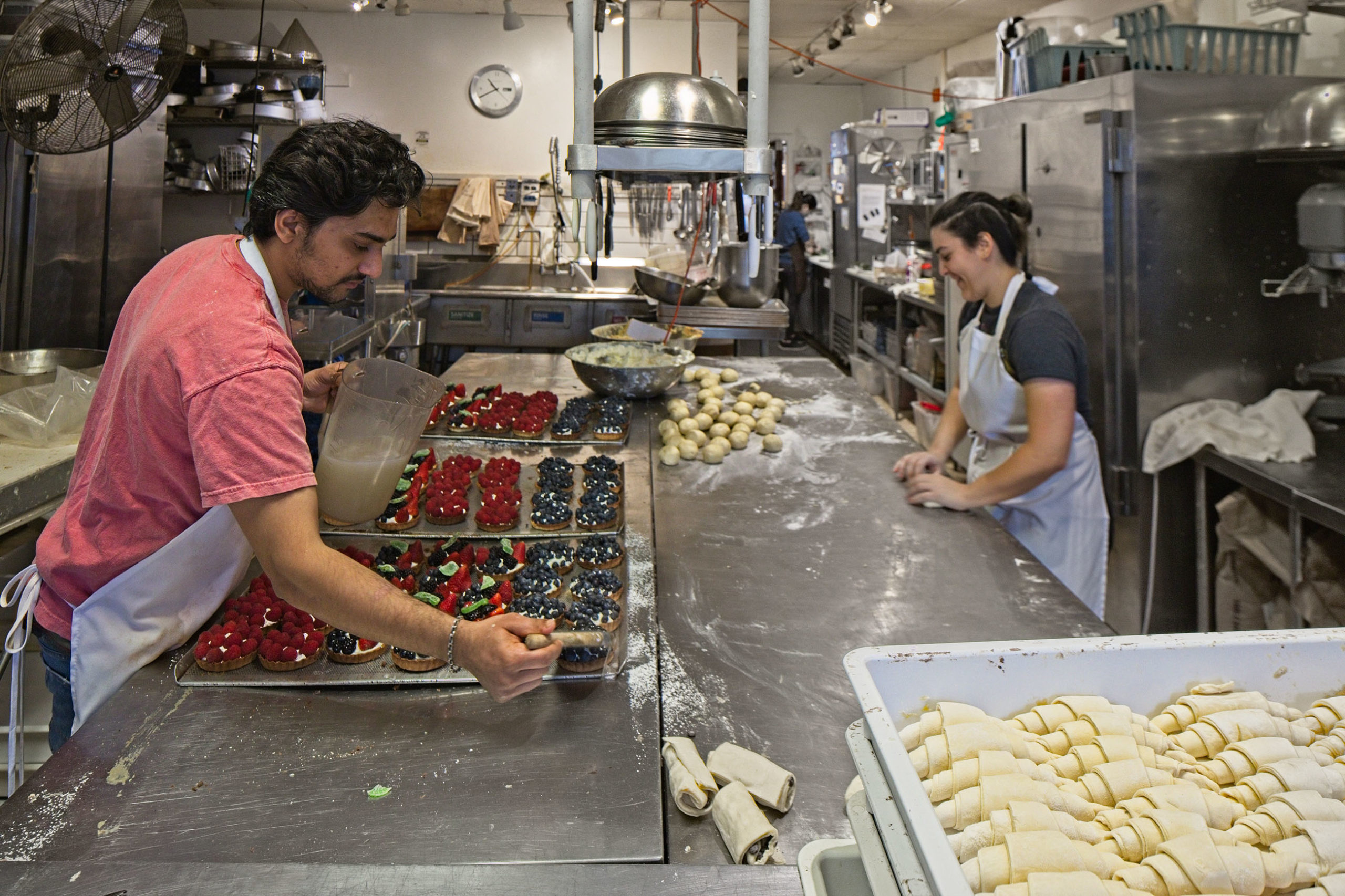
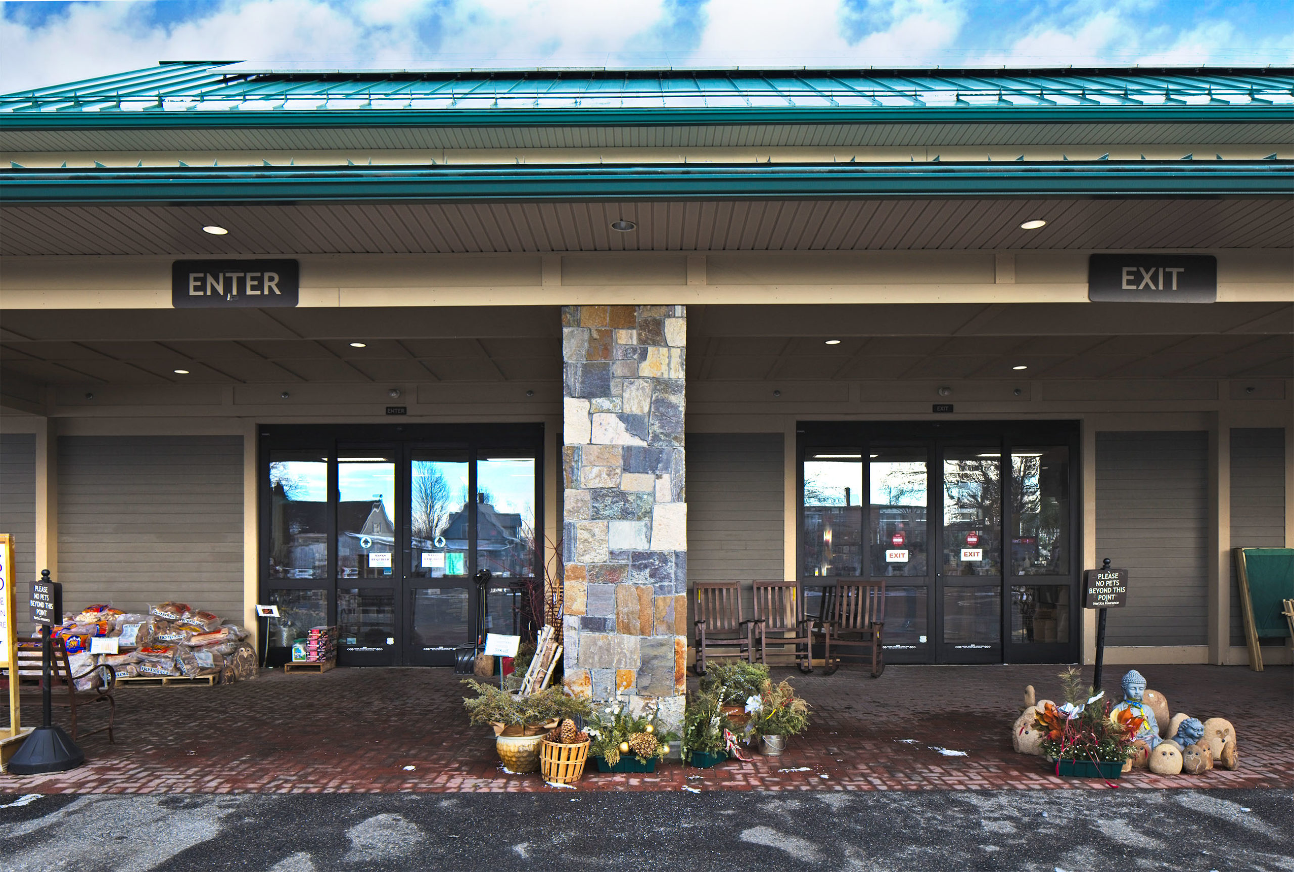
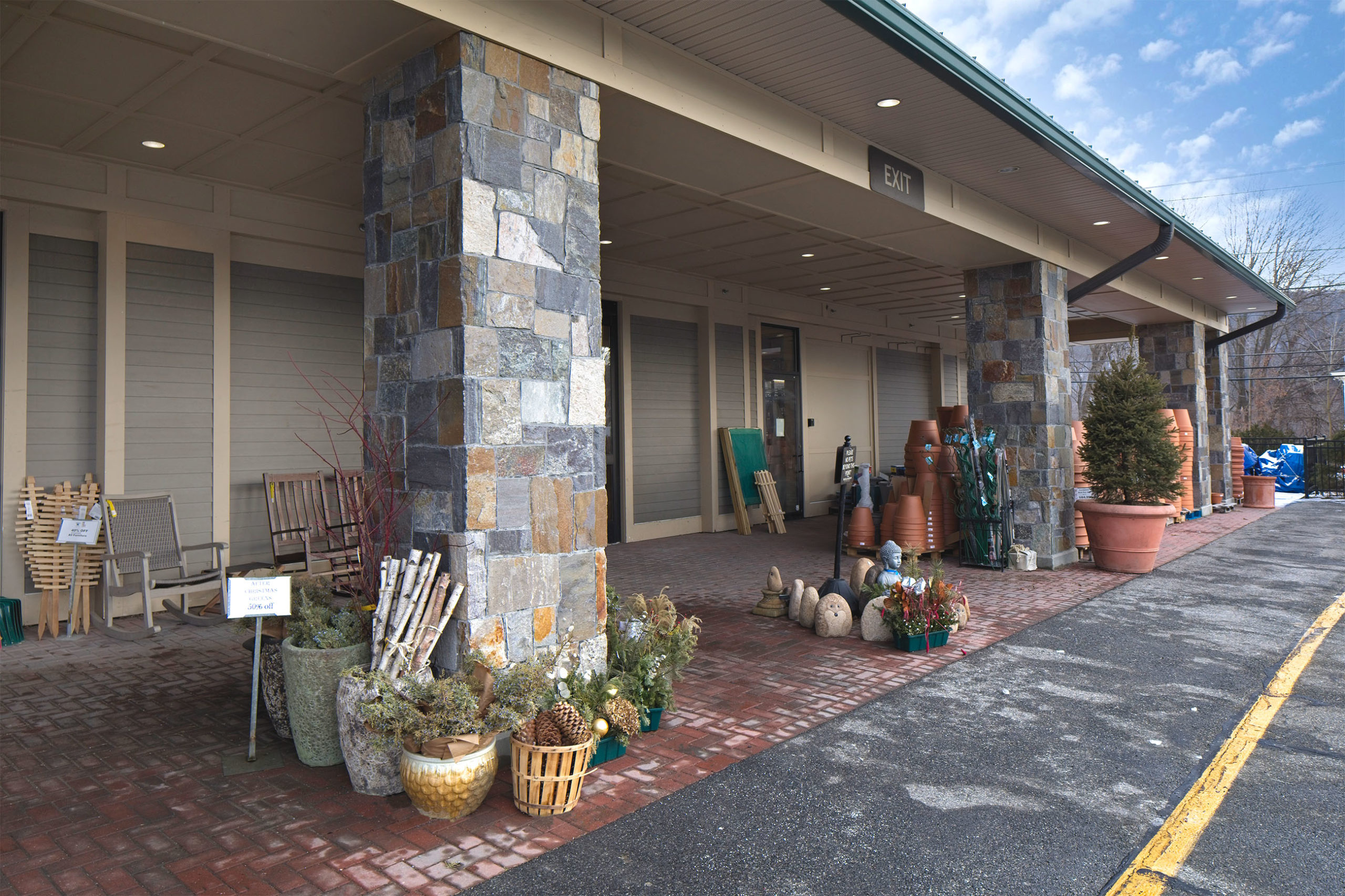
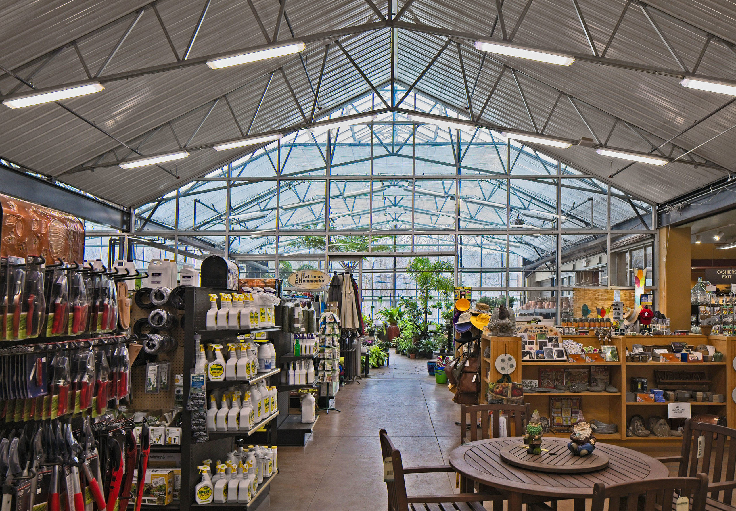
BlueLine Design
Photography website
The previous site was in dire need of modernization with missing links, email that didn’t work, portfolio imagery two decades old and little copy. We get it. When you’re busy working for your client, your own work will (and should) take the backseat every time.
Supplemental photography was brought in by our photographer and copy was written throughout from romance brand copy to project-specific copy to highlight the full process.
Prior to launch, the client decided to use a very old logo, nixed the modern use of typography and the highlighted studio section. We felt this really set the client apart, a really great intention of the local area. For whatever reason he wasn’t ready.
Alas, as this is our portfolio work and this was the direction several months of approvals and it’s worth showing because it just might click with another client down the line.
